
PORTFOLIO
PORTFOLIO
Julielicha11@gmail.com
Hi, I’m Julie! a fourth year Graphic design student based in Toronto. Over the years, I’ve developed skills across animation, web design, publications, packaging, and printed matter, building a multidisciplinary approach to visual communication. I’m passionate about creating work that is both visually engaging and conceptually thoughtful. Whether designing for screen or print, I focus on clarity, structure, and intentional storytelling.
Julie Lichaa
Graphic designer
“Turning ideas into experiences.”
Selected works
-
Coca-Cola Exhibition poster
Nespresso Poster
Tri-Brochure
Typography
Social Media Integration Posters
-
Bonjus
Illustrations made for packaging
Final Dielines
POPS
-
Lahazat (Moments)
-
Projection Mapping
Stop-Motion Animation
-
Hue By You
Introducing Chromatopia
-
Luminary Device
The Final Outcome
Printed Matter
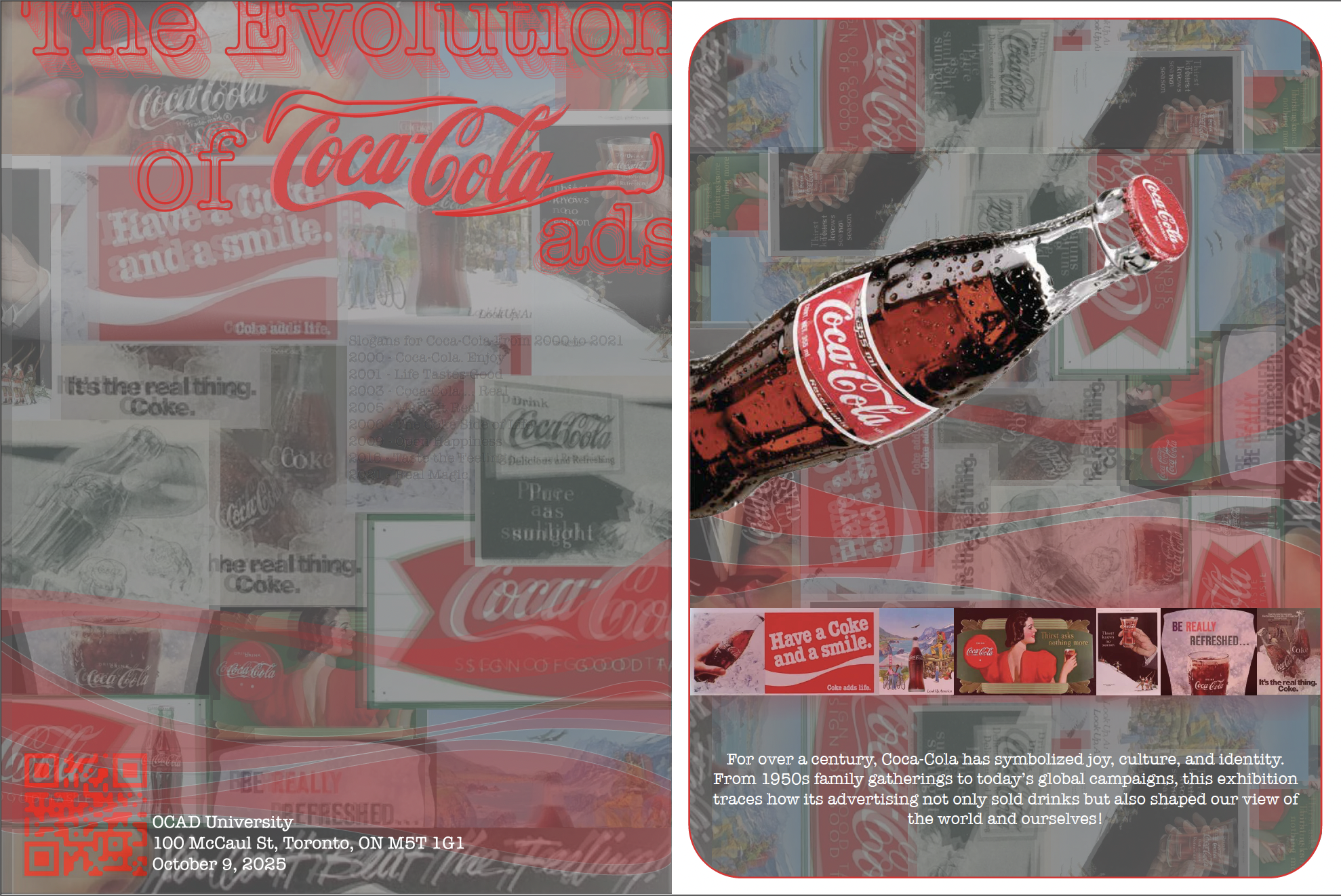
This double-sided poster was designed for an exhibition exploring the evolution of Coca-Cola, highlighting the brand’s enduring visual identity across time ever since it existed. By layering archival imagery with contemporary composition, the design reflects both its historical progression and cultural impact. The use of transparency, bold red tones, and dynamic imagery creates a sense of movement, guiding viewers through different eras while reinforcing Coca-Cola’s iconic presence within the exhibition space.
Nespresso
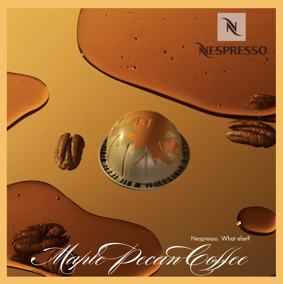
This poster was inspired by a visit to a Nespresso boutique, where I was given their product catalogue to go through and became particularly aware of the relationship between layout, alignment, and brand perception. Observing inconsistencies in the visual composition prompted a design response which focused on clarity and precision. This piece emphasizes a clean, balanced layout, where I used rich tones and fluid forms to reflect the depth and refinement of the Nespresso experience, while visually communicating flavor through composition.
Tri-Brochure
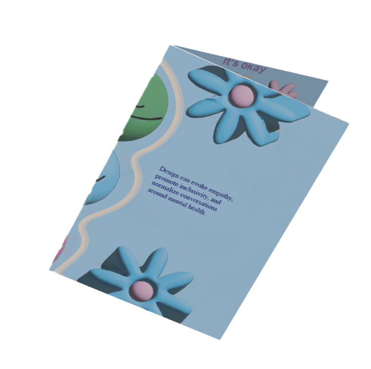
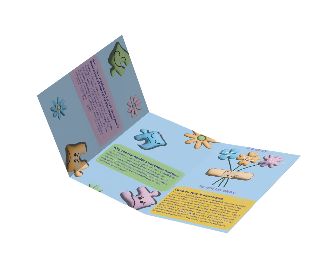
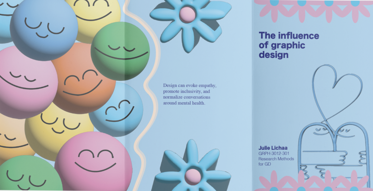
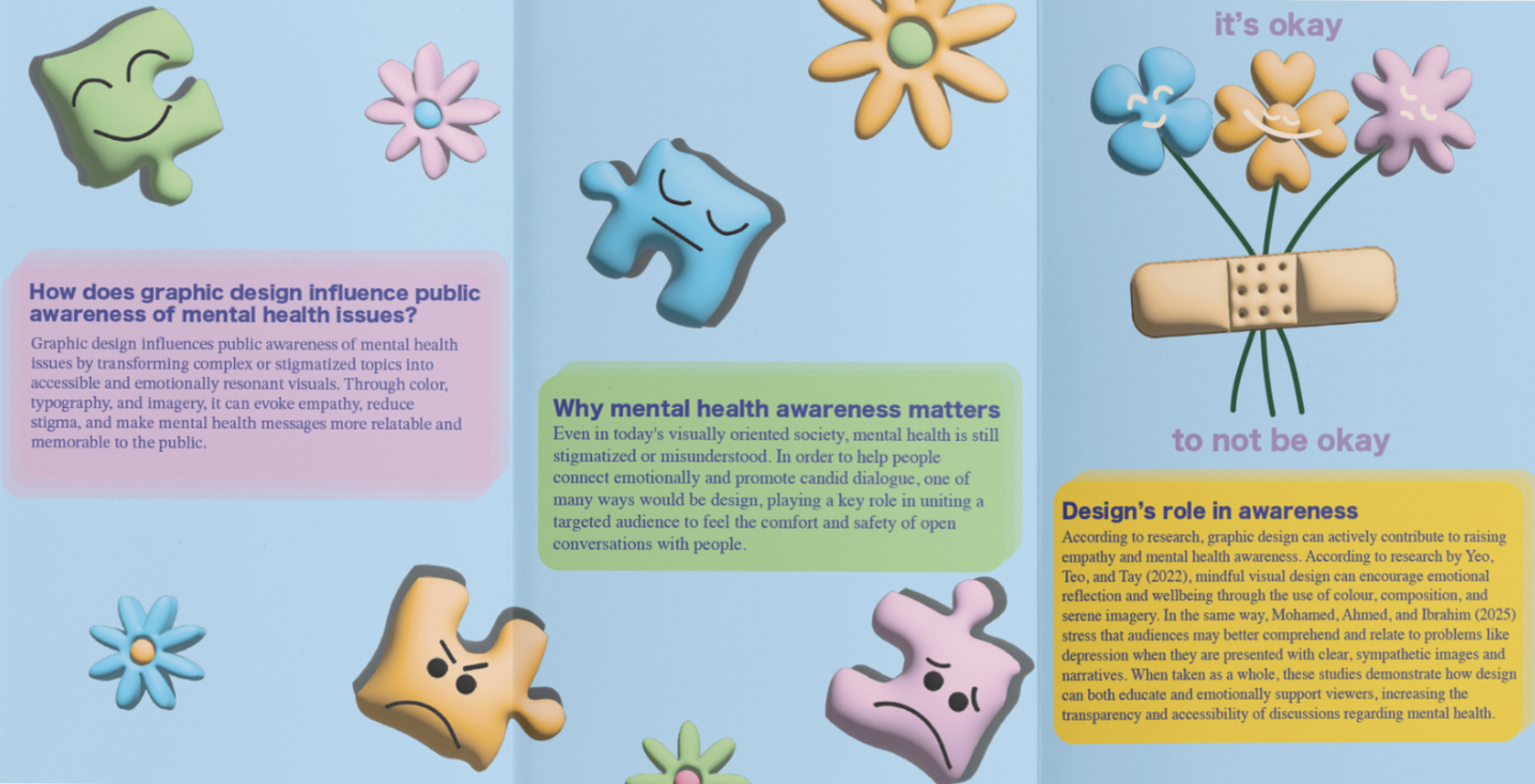
This tri-fold brochure explores the role of graphic design in shaping public awareness of mental health, translating research into an accessible and emotionally engaging format. The color palette was intentionally selected based on principles of color psychology, using warm and uplifting tones that are known to positively influence a persons mood and create a sense of comfort. The “it’s okay to not be okay” panel acts as an emotional anchor, which aims to encourage openness and reassurance. Through a balanced layout, clear typographic hierarchy, and thoughtful use of color, the design aims to not only inform but also support viewers by promoting understanding and helping normalize conversations around mental health.
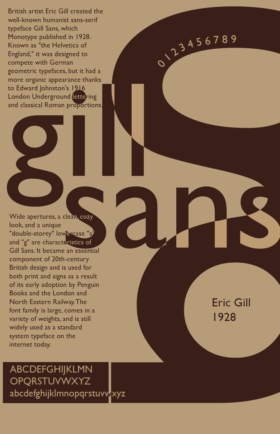
Typography
This piece is a typographic exploration of Gill Sans, a typeface I’ve always been drawn to for its clean yet approachable feel. I wanted to create a poster that celebrates its unique character by pushing the letterforms beyond readability and into a more expressive, visual composition. By playing with contrast, spacing, and scale, the design reflects both the structure and personality that make this typeface stand out to me.
Social Media integration posters
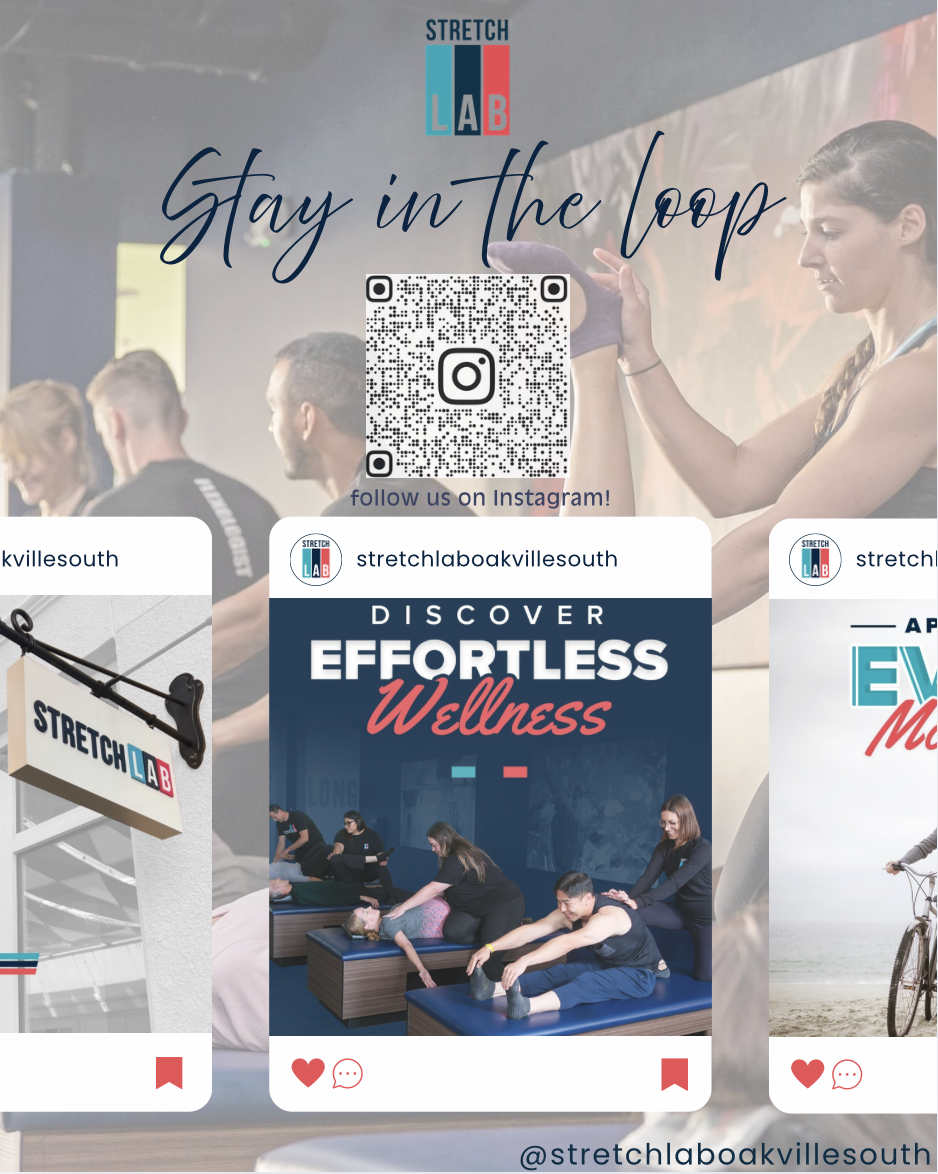
This promotional poster was designed to bridge the gap between the environment in the physical studio and the brand’s digital presence. I used a card-based layout that mirrors the Instagram user interface, making the "Follow Us" call-to-action feel intuitive to the viewer. By balancing high-energy lifestyle photography with a clean, centered QR code, the design still maintains a professional aesthetic while functioning as a direct marketing tool to the target audience.
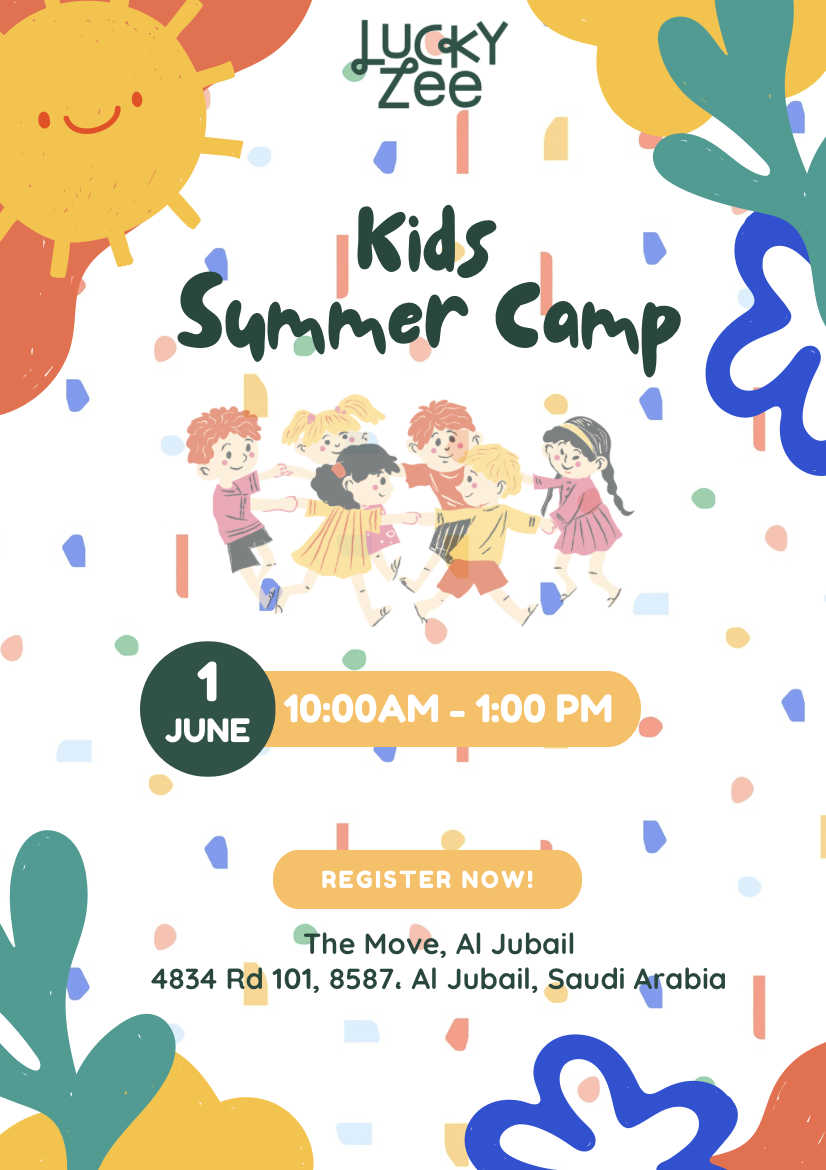
This design captures the high energy and joy of summer through a playful, hand-drawn aesthetic. I used a bright, primary-inspired color palette and organic, "paper-cut" shapes to create a sense of creativity and movement. The central illustration of children playing helps reinforce the community aspect of the camp, while the confetti background adds a celebratory feel that appeals to both children and parents.
Branding
The re-branding of Lebanon’s Bonjus
Growing up in Lebanon, Bonjus was part of every child’s everyday life. It’s what we drank after school, at family gatherings, at the beach, and during long summer afternoons. Every kid had a Bonjus in hand at some point, it almost feels like it was a universal experience. The taste carries so much nostalgia for us because it represents so much than just juice and childhood joy. To this day, kids in Lebanon still drink and love it the same way we did, which makes it feel timeless, connecting generation after generation.
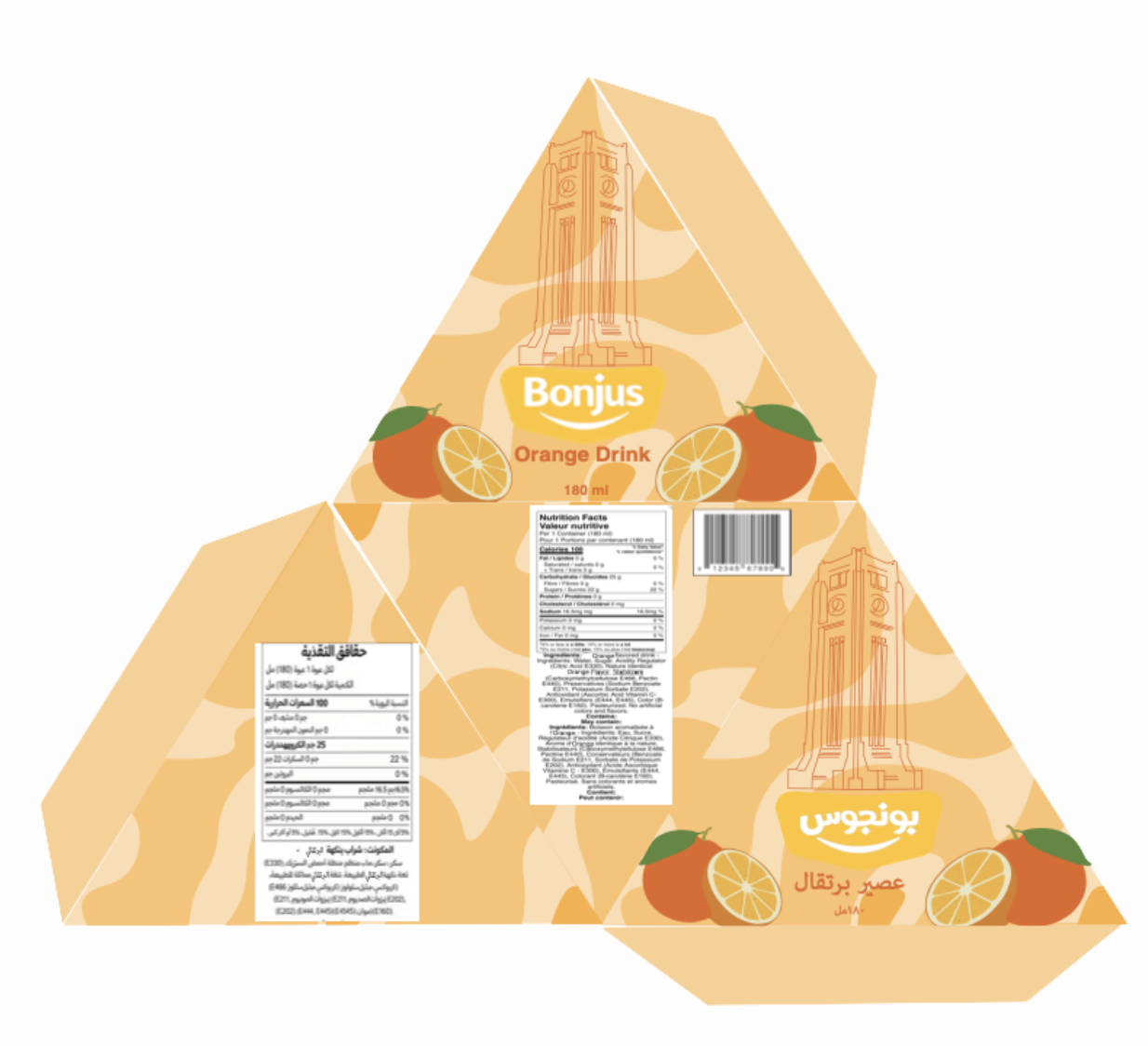
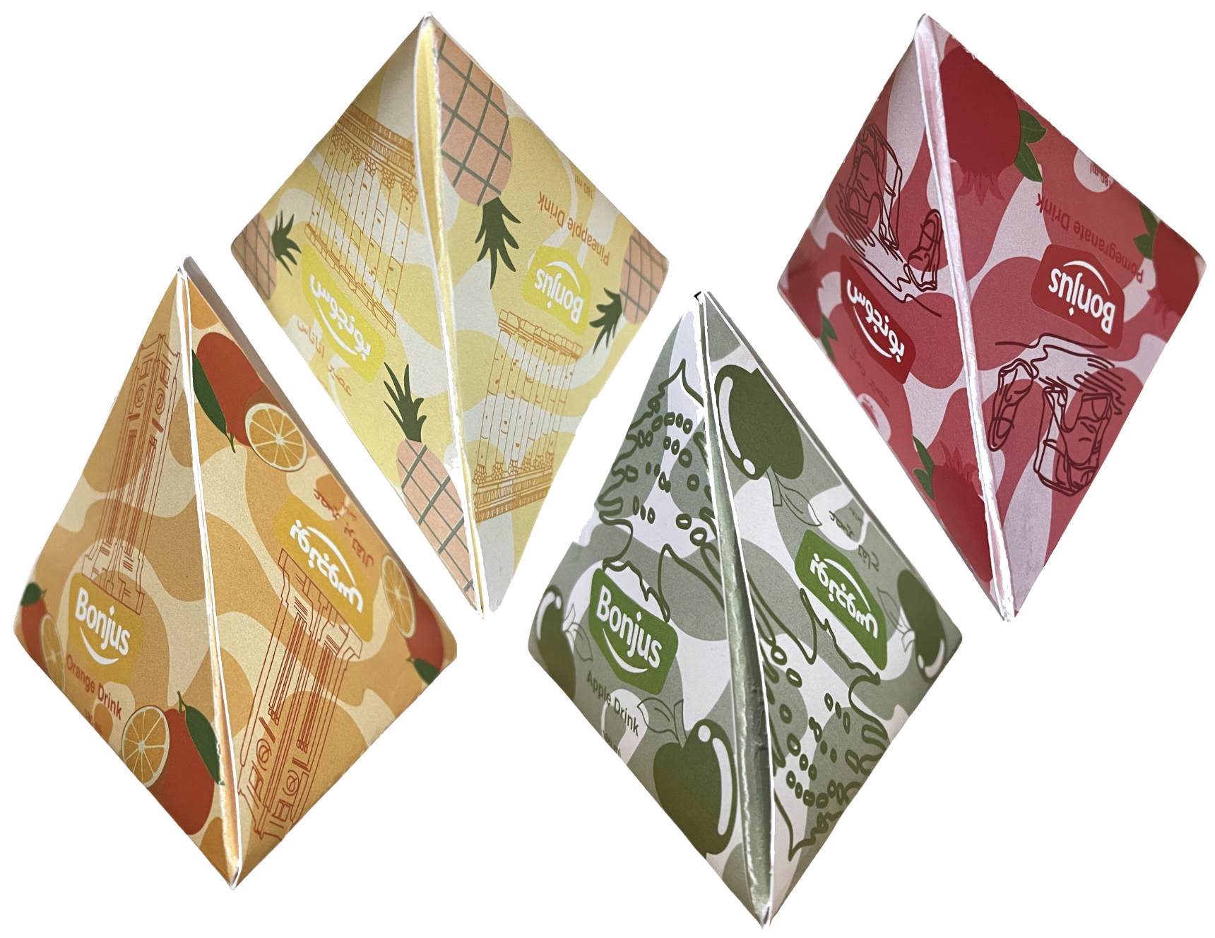
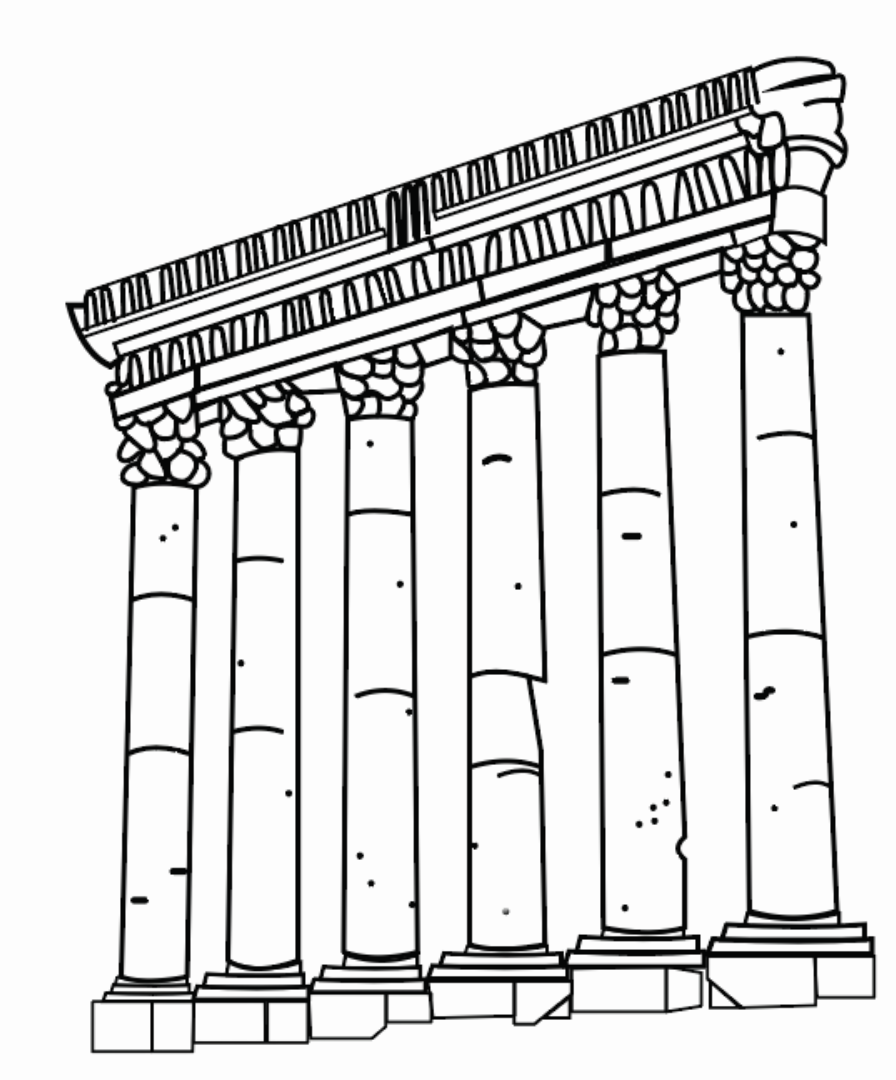
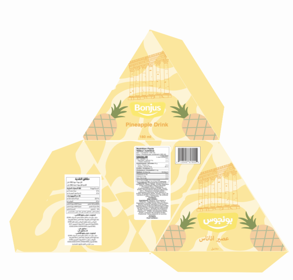
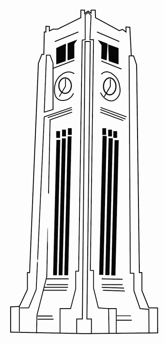
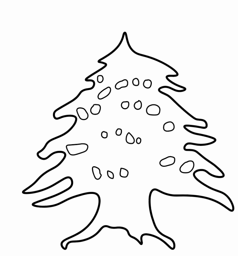
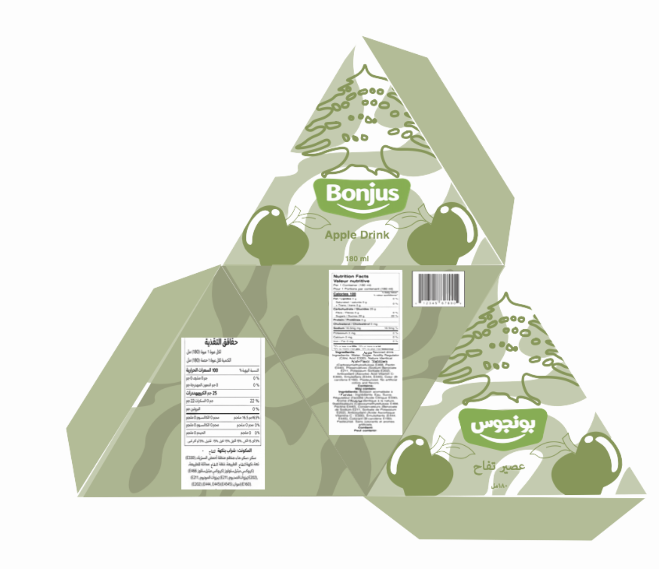
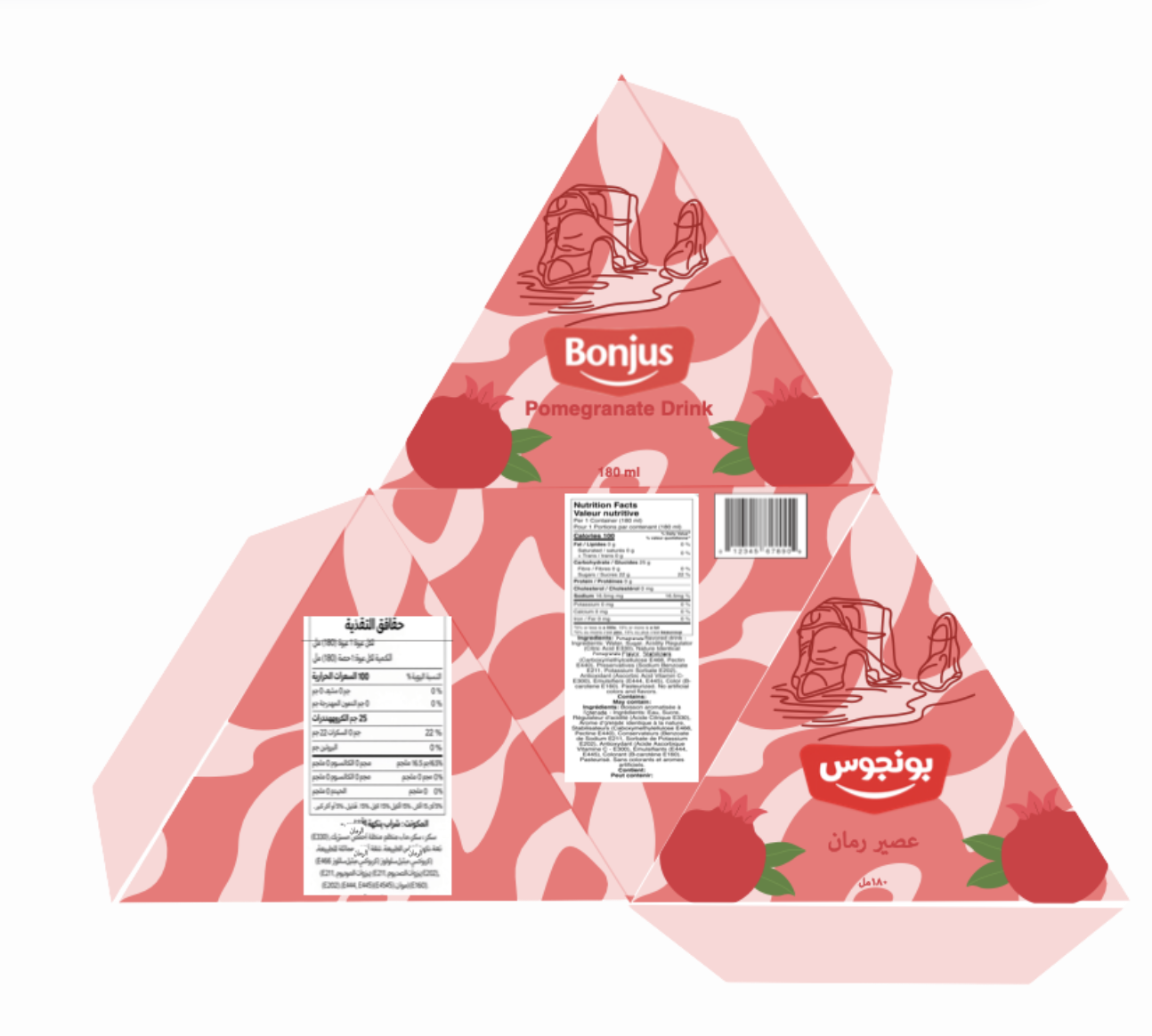
For this packaging concept, we decided to design a pack of eight, featuring four original illustrations, each repeated on two juice boxes within the set. The illustrations depict iconic Lebanese monuments and landmarks that hold cultural and emotional significance for many Lebanese people. The reason we chose these locations is to visually reinforce the brand’s roots, as the company that created the juice (Bonjus) is closely associated with Lebanon. By combining these illustrations into the packaging, the design creates a stronger cultural connection and celebrates the brand’s identity in an authentic and meaningful way.
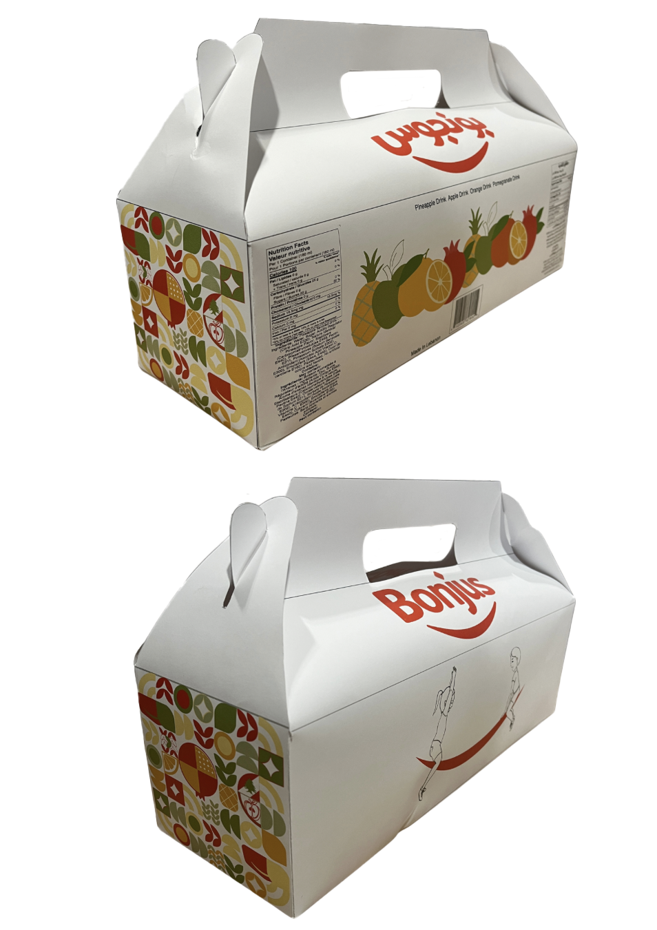
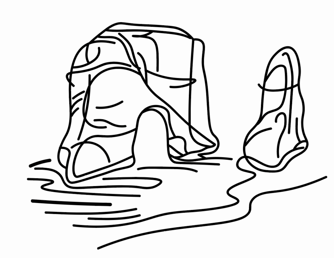
Final Dielines
Apple
Color Palette

Illustrations made for the packaging
Pomegranate



849582
Orange
ee3239
fee593
fbb040
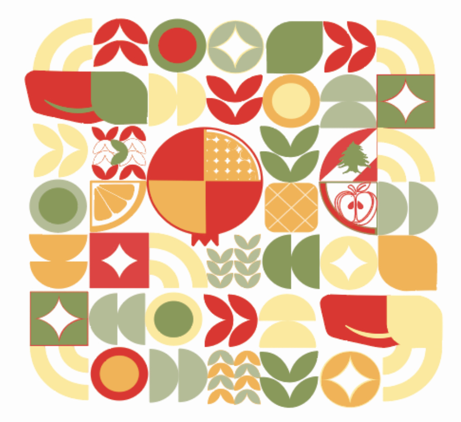
The side packaging features a pattern of geometric shapes that reflects the identity of the brand through subtle but meaningful details. With closer inspection, many of these shapes symbolize key elements of Bonjus, most notably the four flavors created: orange, apple, pineapple, and pomegranate, which are integrated throughout the design. The iconic Bonjus smile is also embedded within the composition, which helps reinforce the brand recognition, while elements inspired by the Lebanese flag highlight the brand’s cultural roots. Combined all together, these details allow the viewer to engage deeply with the design, revealing layers of significant meaning beyond the initial visual impression.
Pineapple
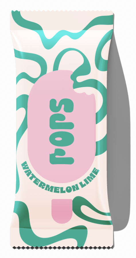
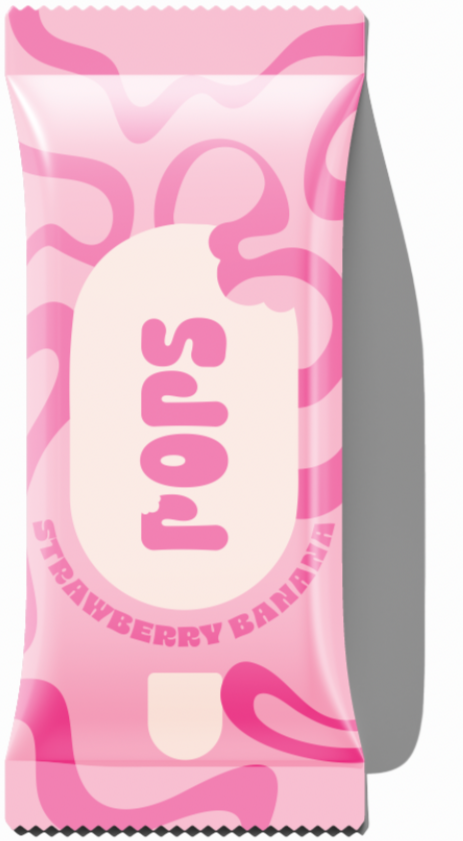
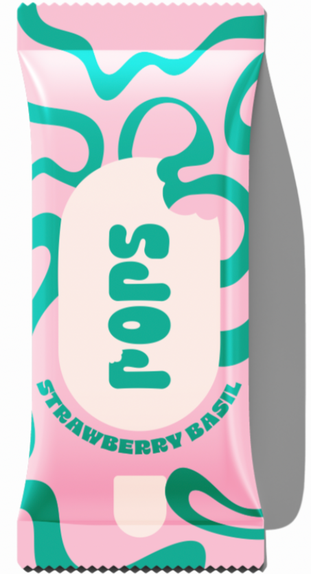
POPS
The branding of a hypothetical ice pop brand
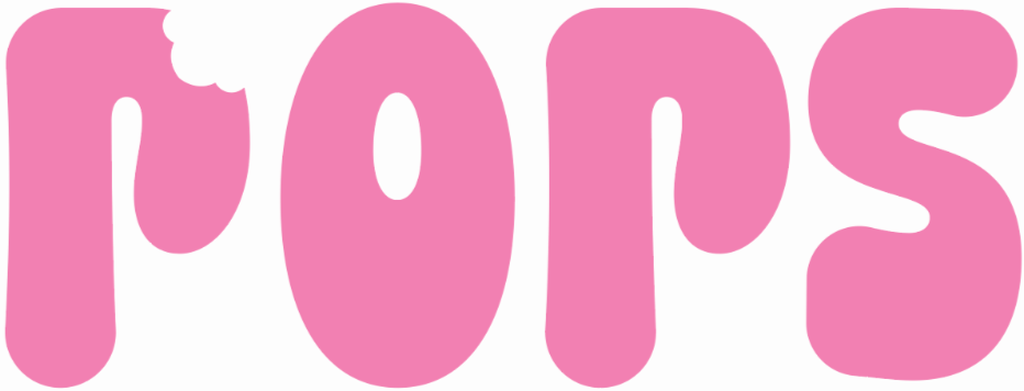
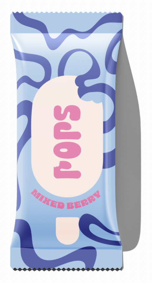
POPS is a playful natural fruit-pop brand designed around the idea of slowing down, staying cool, and enjoying the moment. The identity combines a bright, youthful colour palette with bold typography and tactile graphic elements to create a brand that feels fresh, energetic, and easygoing.
Publications
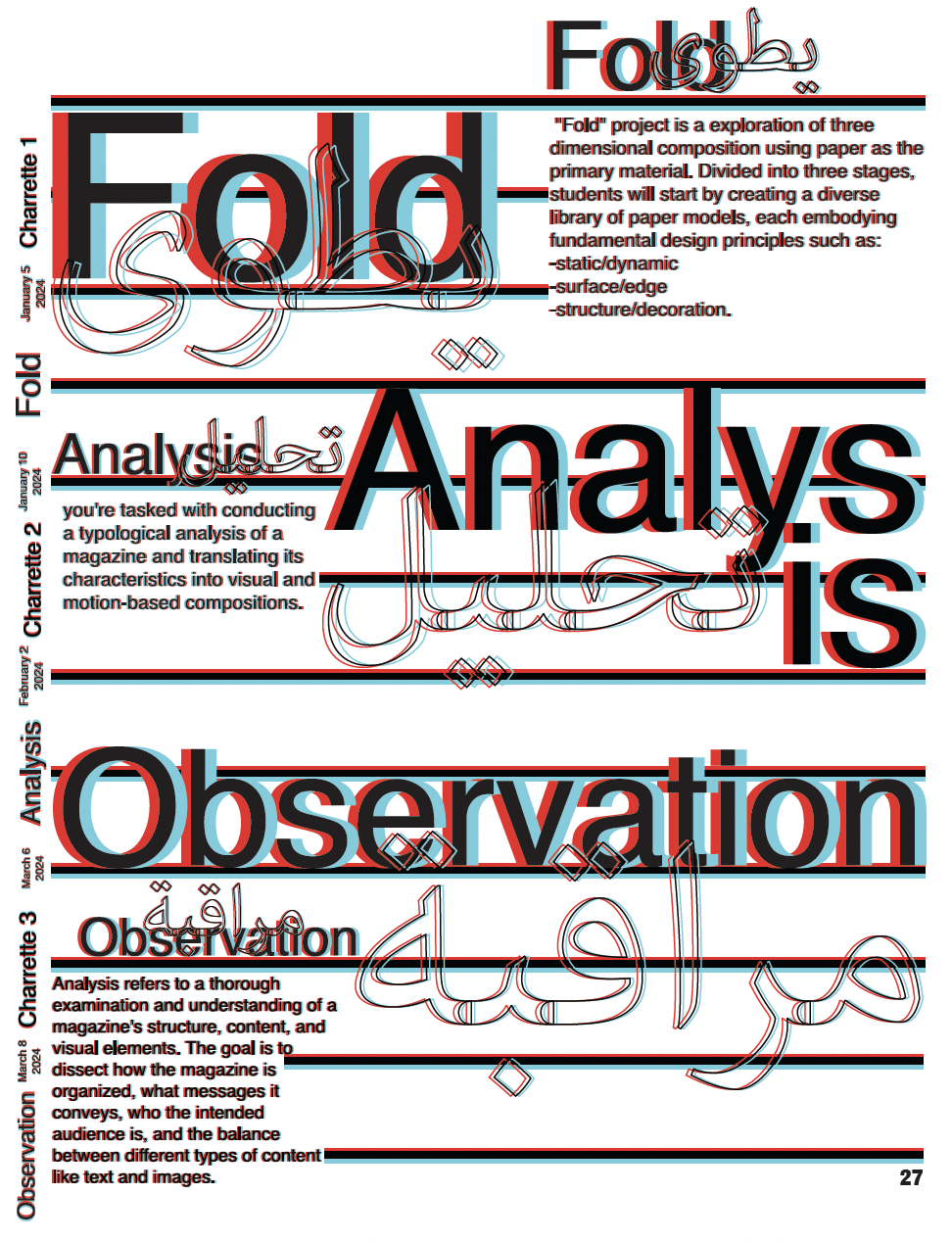
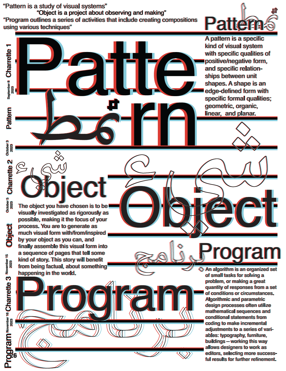
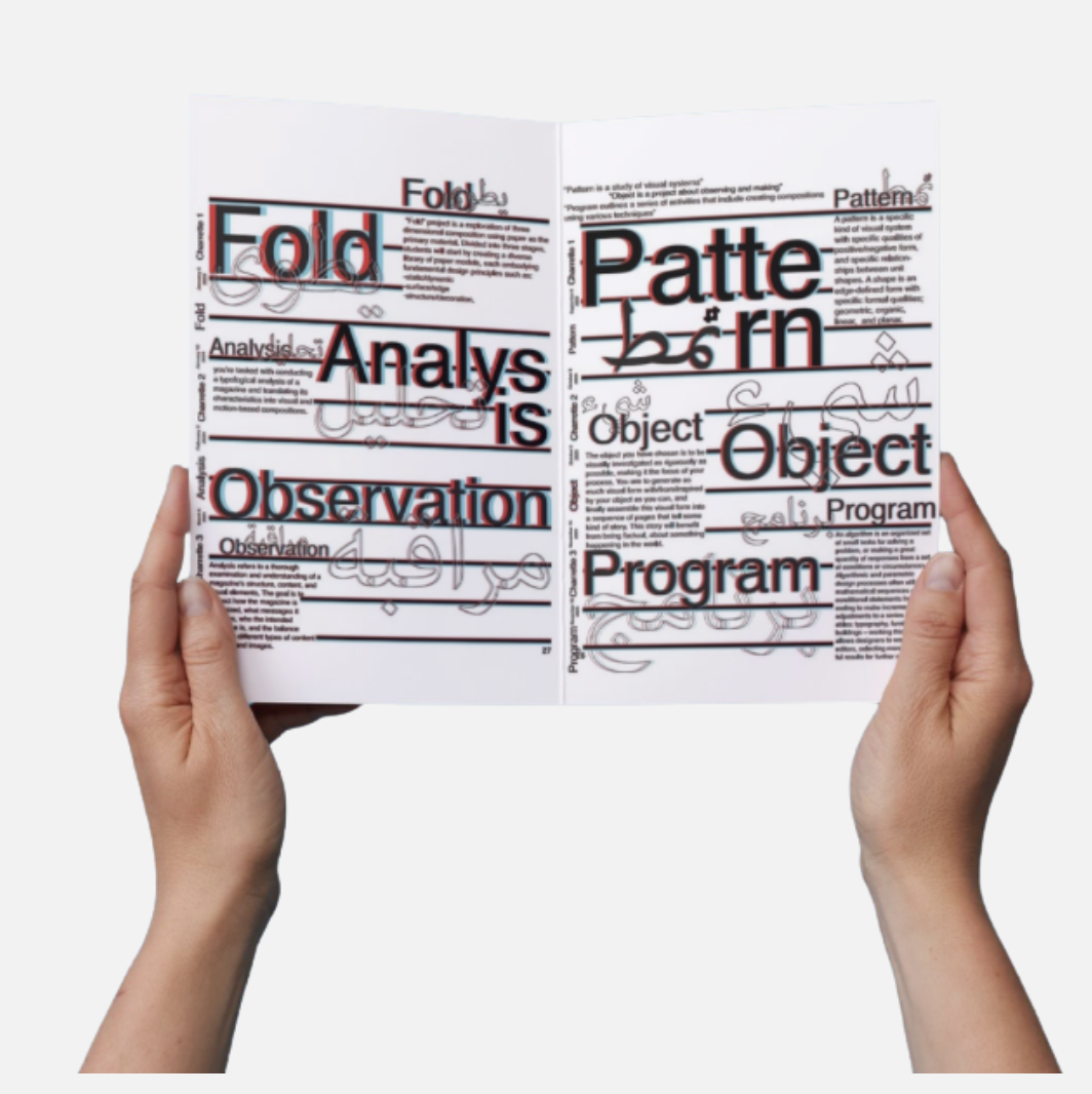
These two pages explores the foundational stages of the different types of projects I have prevciously worked on: Pattern, Object, Program, Fold, Analysis, and Observation through a bilingual typographic system. By layering English and Arabic text, I was able to reflect both conceptual and cultural dualities within my work.
A structured yet intentionally dense book, the composition also mirrors the complexity of my early-stage design thinking, where ideas, systems, and experiments intersect simultaneously rather than linearly.
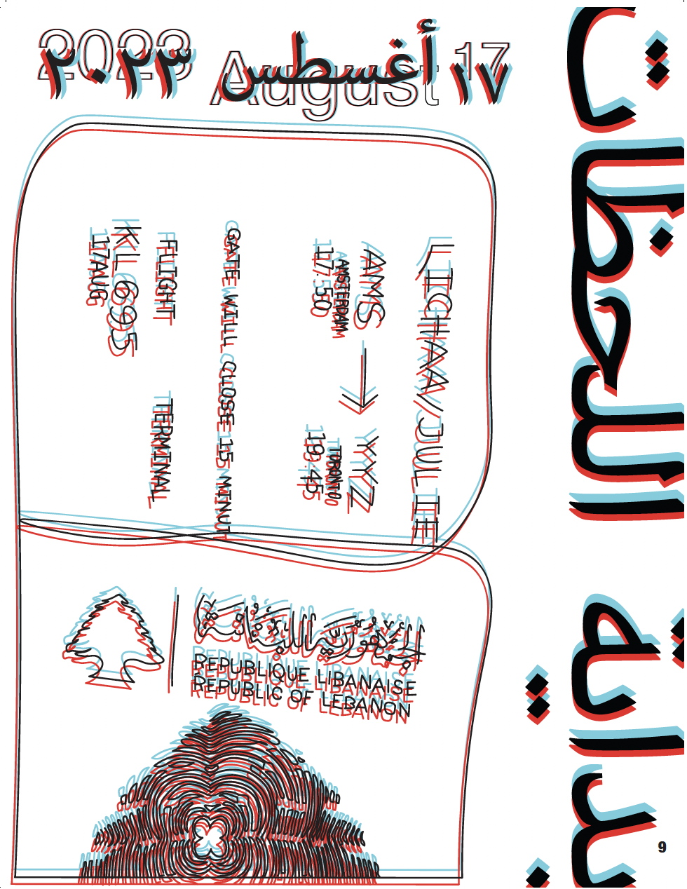
A sneak peak into the book
“The start of ‘moments’”
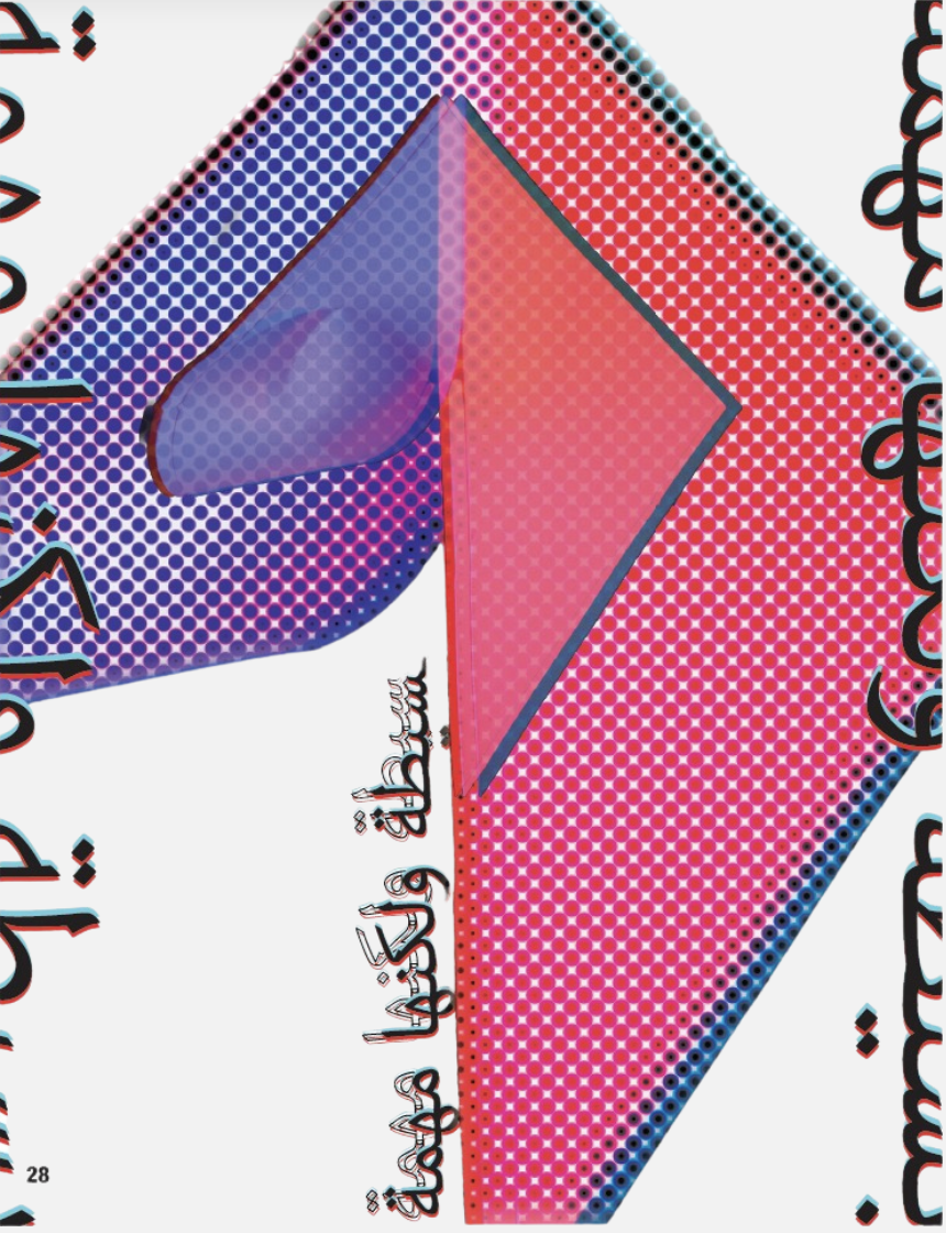
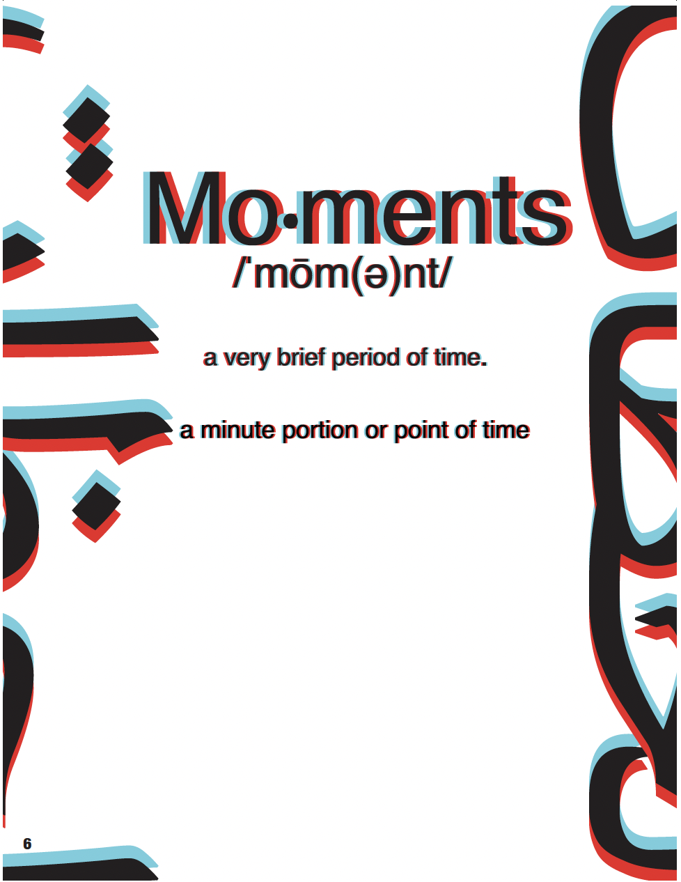
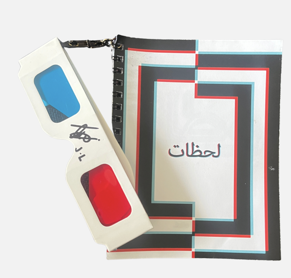
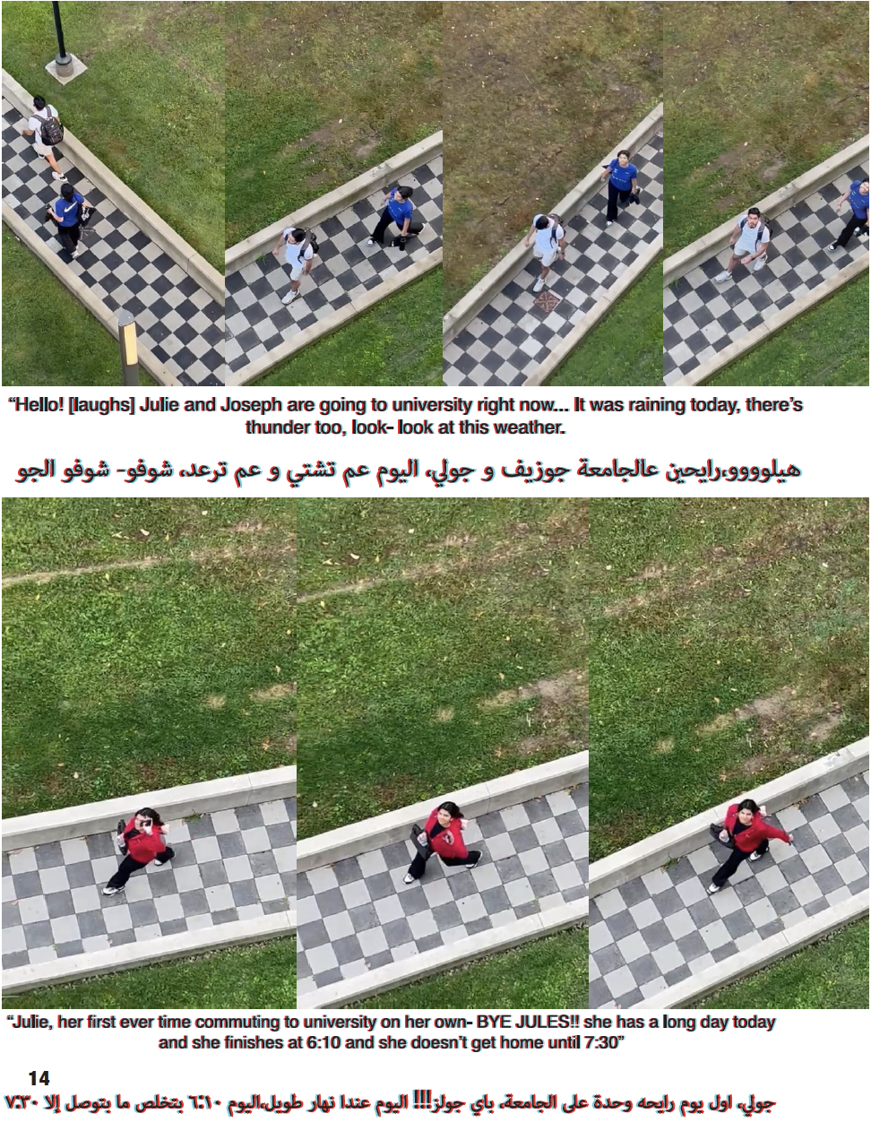
This project is a process book developed from work created in my early years in this program. The goal was to move beyond a traditional portfolio and instead create a “living document” that reflects how I think and work, focusing on process, experimentation, and my personal approach rather than final outcomes.
For my approach, I structured the book as a narrative of my journey, beginning from when I first moved to Canada. It combines both Arabic and English to reflect my background and lived experience. I incorporated a range of materials from my coursework, including writing, visual experiments, and process work, organizing them to emphasize progression, reflection, and personal significance.
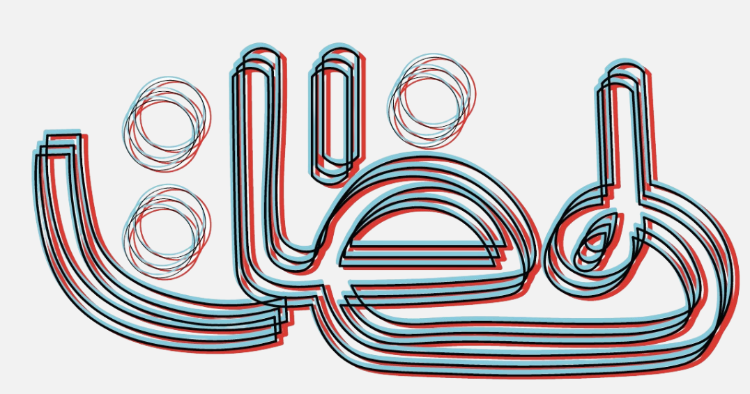
The book explores visual techniques such as the anaglyph effect to represent layered perspectives and shifting viewpoints. To enhance this experience, I physically attached 3D anaglyph glasses to the book, allowing viewers to engage with hidden details and added depth within the pages. Overall, the project captures my design process in a way that is both structured and experiential, translating my development as a designer into a cohesive and interactive physical form.
Animation
Projection mapping
This projection mapping project brings the classic joke “Why was 6 afraid of 7? Because 7 ate 9” to life through animation on a cube. My approach on this pieace was more of a humorous chase, with 7 relentlessly chasing the 9 across the cube’s surfaces.
By using the cube as a stage, the animation plays with surprise and timing, making thecharacters disappear around edges and reappear on new faces, helping me turn a simple joke into a dynamic experience. The project leans more into humor and exaggeration, transforming a familiar punchline into something visually engaging.
The animation itself
Stop-Motion Animation
This stop-motion animation uses LEGO to construct a short, tension-driven narrative. The piece follows a driver attempting to escape as a countdown progresses, with pacing and repetition used to build urgency.
An Iron Man LEGO piece is repurposed as the countdown device, adding a playful yet suspenseful visual element that guides the sequence. Through frame-by-frame animation, the project helped me explore timing, movement, and how simple objects can be altered to communicate story within a compact scene.
Web Design
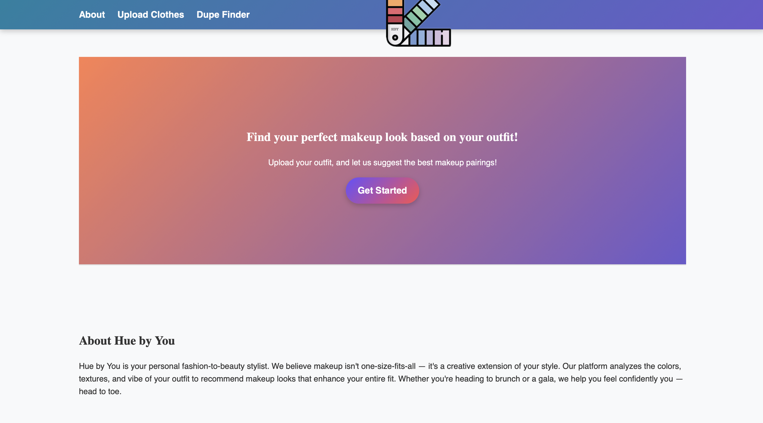
Hue by You is an interactive web-based concept that was created by me to reimagine how users approach makeup by connecting it directly to their wardrobe. The platform allows users to upload an image of their outfit, which is then analyzed to generate personalized makeup recommendations that complement color, tone, and overall style.
The project explores the relationship between fashion and beauty through a fashion/makeup lens, focusing on accessibility, customization, and everyday decision-making. From concept development to interface design, I aimed to create an experience that feels intuitive, visually engaging, and tailored to individual expression.
Hue by You reflects my interest in blending design with technology, while solving a relatable problem helping its users feel more confident and cohesive in how they present themselves.
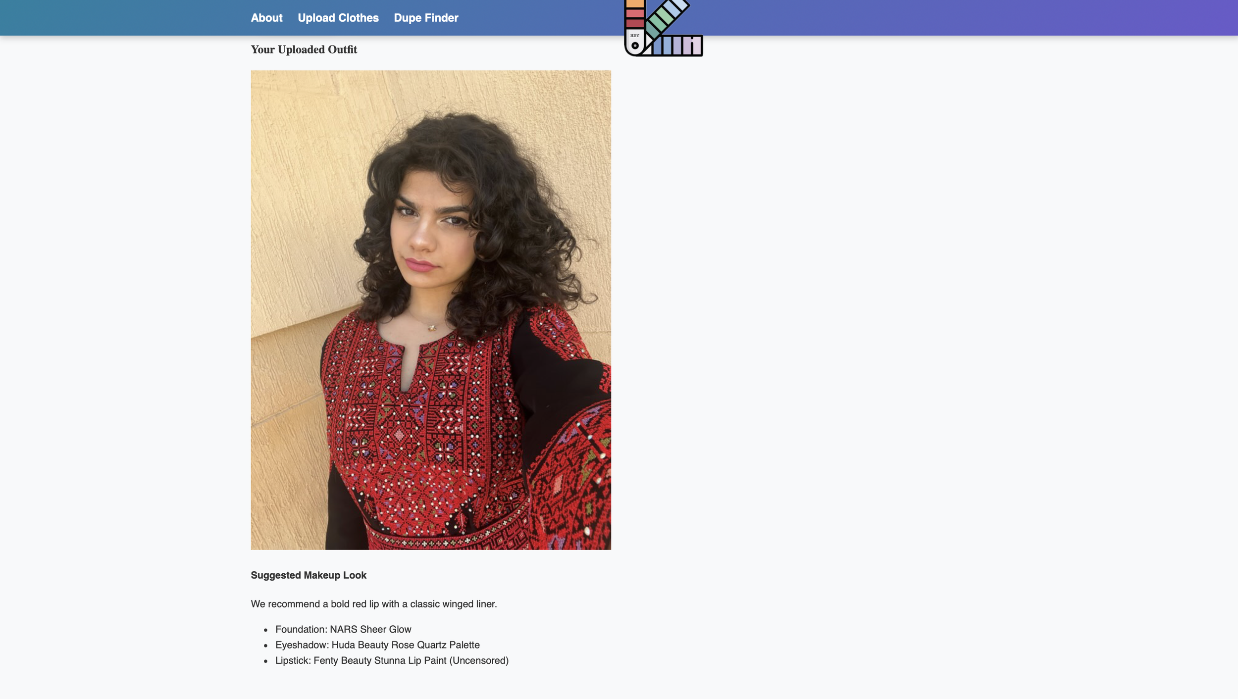
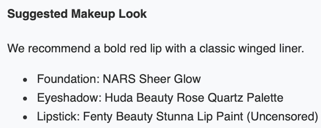
Suggested Makeup Look based on the picture above
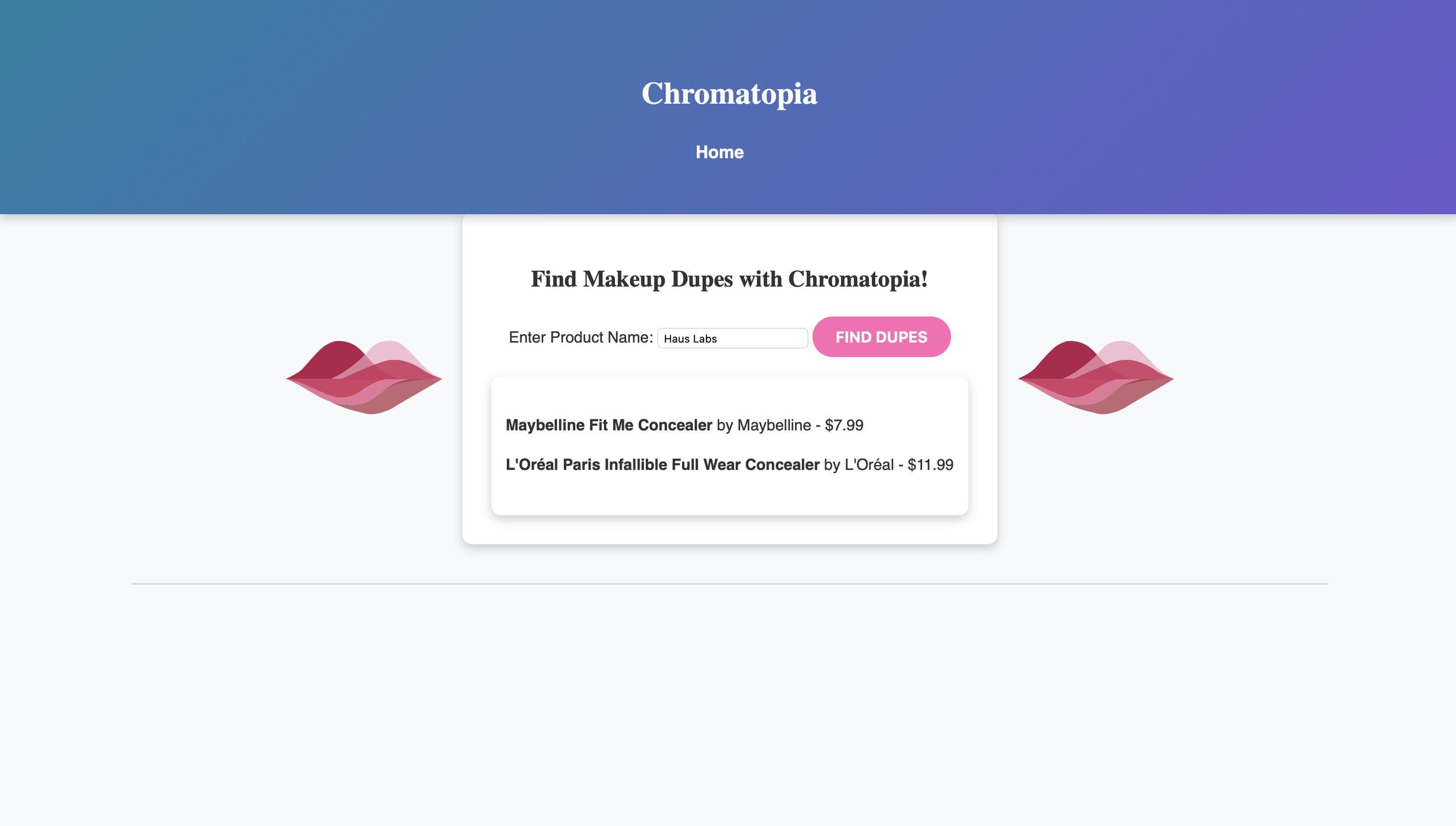
The Dupe Finder is a feature within Hue by You designed to make beauty more accessible and budget friendly. By analyzing color, undertone, and finish, the tool offers affordable alternatives to high-end makeup products, allowing users to achieve similar looks without the premium price tag.
This feature was developed with inclusivity and practicality in mind, addressing the common challenge of finding comparable products across different brands. It helps enhance the overall user experience by not only recommending makeup that matches an outfit, but also ensuring those recommendations are attainable for a wider audience.
Through the Dupe Finder, I explored how design and technology can support smarter consumer choices while maintaining a personalized and visually connected experience.
For example-
Introducing Chromatopia
Hue By You’s Makeup Dupe Finder
The website concludes with a dedicated contact and social section, designed to extend the user experience beyond the platform and encourage ongoing engagement with the brand.
3D Printing - Environmental Design
The creation of my Luminary Device
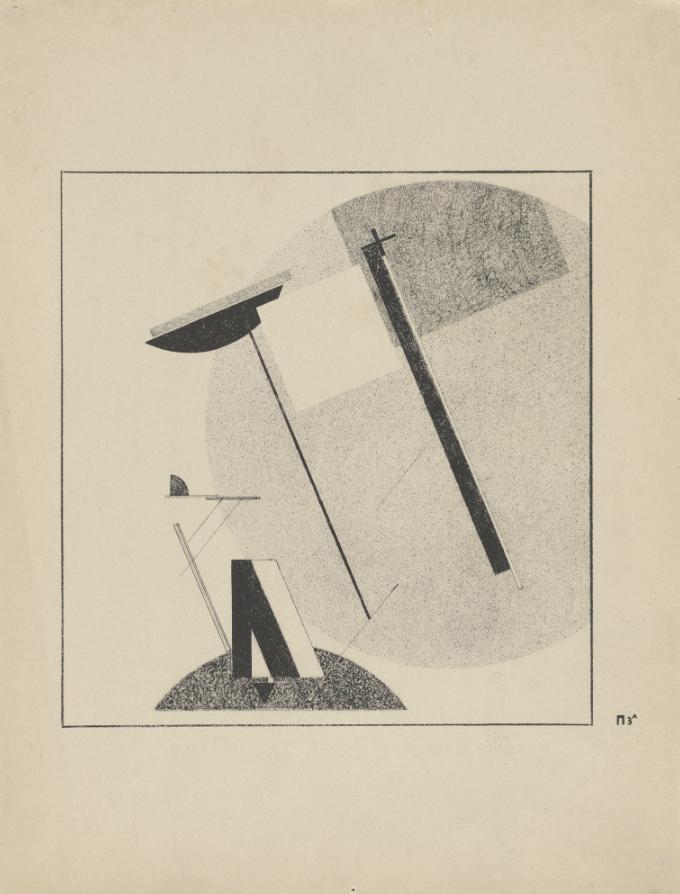
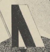
El Lissitzky - Proun 3A from Proun 1920
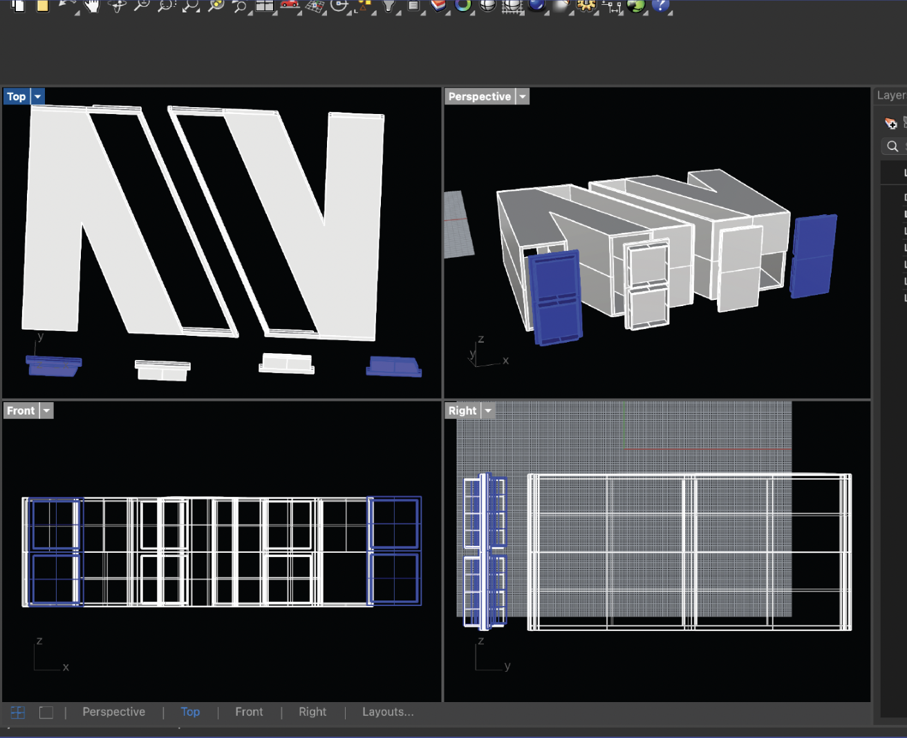
This model showcases the technical development process behind my luminary device, created using the Rhinoceros 3D software. The form is constructed through a sequence of precise geometric operations, translating an abstract concept into a properly structured three-dimensional object.
Working across multiple viewports: top, front, right, and perspective, allowed me to carefully control proportion and alignment. The design is built from modular components, focusing on clarity in construction and enabling a more efficient approach to the assembly and iteration of the device.
This part of my process is focused on process and precision, demonstrating how complex forms can be developed from simple geometric foundations.
The Final Outcome
Design used as reference before the implementation of the device
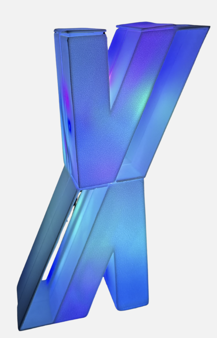
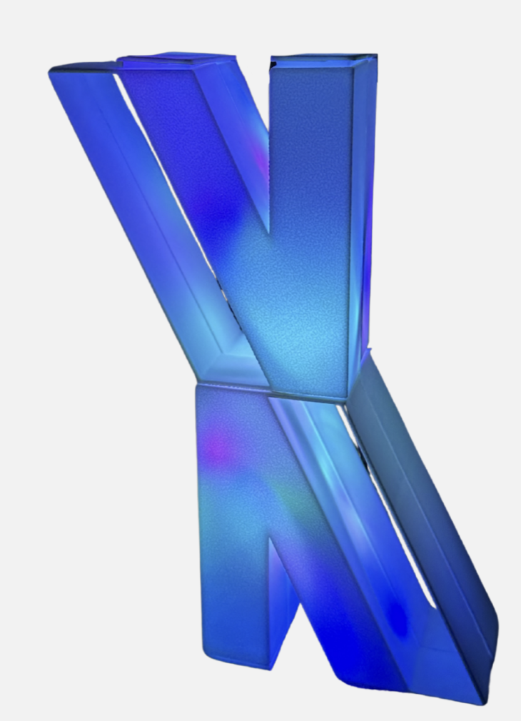
The final outcome of my luminary device helped me explore the use of geometric form and light through the design thorugh my 3D-printed luminary device. The design focuses on balance, proportion, and the interaction between solid and void, allowing light to pass through and create dynamic shadows. The result is a minimal yet functional luminary device that emphasizes both form and sense of space.